 I found this map of UCLA from the school's website. The image provides us with a detailed picture of the buildings, facilities, and dorms of the university. I chose to include this map in my blog because I think that our surroundings are an important part of our daily lives. Also, I believe that one should be well acquainted with one's school. Although I am a second year, I still do not know every single building on campus. Thus, I would like to learn more about maps and spatial analysis in order to familiarize myself fully with UCLA.
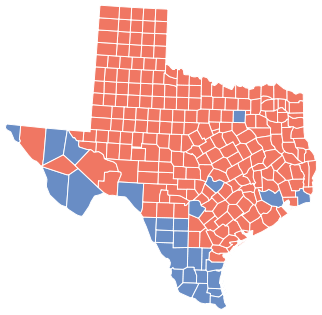 I found this map by using the Google search engine. This map of the state of Texas depicts the presidential electoral results in 2008 by county. This map is particularly interesting to me because I come from Dallas, Texas. Being a political science major it is intriguing to note that many large urban areas of Texas such as Dallas, Houston, and Austin have turned blue for the very first time in this election. This pattern signifies the role of urban versus rural in elections. In addition, it symbolizes the values associated with that particular sector.
I found this political map from an online blog by using Google Images. It depicts the presidential electoral results in the 2008 race between Republican Joe Biden and Democrat Barack Obama. I find this map very interesting because it reveals much about our nation's political, social, and economic demography. Although, simply labeling states either red or blue is not sufficient, this map still provides us with an overall view of the political choices of the different regions of America.