Wednesday, December 2, 2009

Lab 8: Census


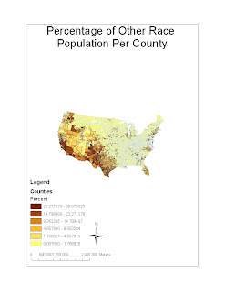
The first map illustrates the percentage of “other race” population per county. Since African and Asian Americans have already been accounted for, I will assume that “other race” includes Hispanics as well as other groups. According to the map, it is obvious that this category of people is very much clustered along the West coast and the southwestern region of the nation. This trend is representative of Hispanic and Mexican-American immigration to the United States. Thus, this map, through the use of GIS, can help us identify institutions, policies, and facilities needed to better help this certain group of people.
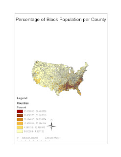
The second map portrays the percentage of African Americans per county. Historically speaking, Blacks have always held a presence in the South. Dating back to colonial times, enslaved people from Africa were brought to this region to cultivate “King Cotton.” To this day, as exhibited by the map, the South is home to this group of people. The use of GIS in making this map can better help us realize the pattern of African American settlement in modern times.
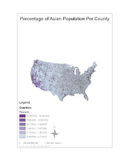
The last map shows the Asian American population as a percentage of a county’s populace. Unlike the first two maps, this one is saturated along both coastal lines. Thus, it can be concluded that the Asian American communities are mostly along either the West or the East coast. This is another useful pattern that is helpful in decision making.
The Census maps overall confirmed many of my preconceived notions of ethnic group patterns in the United States. While the African American population is strong in the South due to historical events, the Hispanic population is predominant in the Southwest due to economic opportunities. Lastly, the Asian American population is coastal in nature and mostly invisible in the interior of America. These maps are useful in that they highlight the settlement tendencies of certain groups. In addition, these maps have the potential of pointing out the flaws and injustices of American history and society. Lastly, these maps can also be made useful to many professionals. Politicians use these as a means of gerrymandering, while law makers use them as a means to figure out the best policies and voting trends.
In conclusion, working with GIS has been a tough, but rewarding experience. Working with such software can be difficult and frustrating at times. However, the end product is fulfilling. Maps created from GIS are not only informative and useful, but also eye catching. They reveal much about the world in which we live. From mapping the station fire using overlay analysis to working with data from the Census Bureau, my experience with GIS has been a positive one. I have learned not only about the software, but also about the patterns and phenomenon of the world in which we live.

Monday, November 16, 2009

Lab 6: Digital Elevation Models


1. Shaded Relief Map
2. Slope Map
3. Aspect Map
4. 3-D Model

For the assignment for Lab 6, I selected a region of western Colorado. I chose this area because of the various different mountain ranges and hills found here in order to create a more drastic elevation model. The extent is as follows. Top: 39.114, Left: -107.582, Right: -106.988, Bottom: 38.737. Lastly, the geographic coordinate system used was GCS North American 1983.


Lab 7: Mapping the Station Fire


The Station Fire which struck Los Angeles County in September of 2009 was one of the most deadliest and destructive forest fires ever seen. Officials name it as the most destructive fire in modern Southern California history. Starting around 26th August and finally ending in October, the Station Fire blazed the Angeles National Forest Area for almost a month, destroying 209 structures, 90 of which were homes.
The fire was fully contained on October 16th, with the help of light rainfall in the area. It was later announced that the cause of the fire was actually arson, initiating a homicide investigation. Unfortunately, two firefighters were killed in the line of duty. It can safely be concluded that this was no mere spark, but a full blown blaze that threatened the residents of LA county and surrounding areas.
As a precautionary and preventive measure, the fire department issued evacuations for surrounding neighborhoods. The areas most affected by the fire were the communities of La Canada Flintridge, Glendale, Acton, La Crescenta, Pasadena, Littlerock, Altadena, Sunland, and Tujunga. Many of these populated areas had a mandatory evacuation, which was lifted as of September 6th as the fire became more manageable. Nevertheless, the wildfire threatened the very sanctity and safety of citizens residing in these neighborhoods.
As shown on the map, the fire progression worsened day by day until the firefighters had full control of it. Not only did it threaten the livelihood of neighboring areas, it also threatened surrounding structures such as the Mount Wilson Observatory which houses expensive astronomical equipment. Such damage would be costly and even irreplaceable.
In conclusion, the Station Fire which hit Los Angeles County hard early this year has been named one of the most dangerous and long lasting in modern history. As shown on the map, it threatened to come dangerously close to many residential areas. GIS is an important tool in mapping and analyzing such incidents. From natural disasters to other catastrophes, GIS has proved itself as a useful tool. Not only does it allow users to show progression, it also allows us to display other features such as 3-D models, elevation, and spatial analysis. It is these very features of GIS that makes it so useful to the geographic community. In addition, it goes beyond the realms of geography itself. Countless other professions and fields make use of this application to display and analyze information in the form of maps.


Monday, November 9, 2009

Lab 5: Projections in ArcGIS


The mathematical transformation of a three dimensional world to a two dimensional plane is referred to as a map projection. There are various different categories of projections. These differ in what is preserved such as angles or distance. However, a similarity found in all projections is the ability to portray the discrepancies that occur as a natural result of transforming the world onto paper or a computer screen.
Conformal map projections aim to preserve angles. Mercator and Stereographic projections are two examples of a conformal map. I noticed that my two conformal maps differed in approximately 3,000 miles when measuring the distance between DC and Kabul. This is yet another consequence of map projections that geographers must keep in mind.
Equal area map projections, on the other hand, seek to preserve area. Hammer and Sinusoidal projections are certain types of equal area maps. When measuring the distance between the two capital cities of America and Afghanistan, I noticed that the results were quite similar for both maps, with only a variance of 200 miles.
Lastly. equidistant map projections aim to preserve distance from a standard point. Examples of this category of map projection are Plate Carree and Equidistant Conic maps. Once again, similar to the discrepancies found in the Conformal maps, the distance between DC and Kabul varied substantially. A difference of around 3,000 miles was found in the two maps.
These distortions and discrepancies highlight the very pitfalls of projecting the 3-D world onto a 2-D surface. However, a certain aspect, may it be angles, area, or distance, must be compromised in one way or the other. This is the reality faced by many a cartographer, traveler, or geographer.

Monday, October 19, 2009

Lab 4: Introducing ArcMap


Using Arc Map in GIS can be a challenging, yet rewarding, experience. Although the tutorial was quite thorough, at times it was difficult completing each task efficiently. I found some parts of the process to be somewhat confusing. However, with the help from the TA and fellow classmates, I was able to complete the exercises.

There are numerous advantages of a program such as ArcMap. Foremost, it allows professionals, as well as amateurs, to view, design, edit, and learn from maps. From solving noise pollution problems to deforestation issues, GIS can be useful in many different lines of work. Politicians, construction workers, and corporations are just a few examples of people and groups that would find this software to be useful.

However, there also exist some problems with this program. Personally, I found it difficult to navigate through a few aspects. Exercise 1 was fairly simple, but the process grew more complex as the tutorial progressed. One must read each step carefully and thoroughly. In addition, to fully understand the function of each step, one should go through the activity multiple times. This can be time consuming and frustrating.

These are the main differences that separate GIS from Neogeography outlets such as Google Maps. While the former is map centric and mainly intended for professionals, the latter is user centric and open to all. Thus, working with mashups can be much more exciting and stimulating than working with GIS, which at times can be difficult and frustrating.

Saturday, October 17, 2009

Lab 3: Neogeography


View

Halloween 2009 in a larger map">

Neogeography, a new division in the field of geography is a recent innovation that has altered the world of GIS. Lately, it has been at the forefront of the profession. Neogeography makes use of existing tools to create maps that users can utilize for information, as well as to share location information with friends and family. Unlike GIS, neogeography is an “amateur,” instead of a “professional” means of map making. In addition, while GIS is rigid, neogeography is pretty flexible.

However, there are some consequences for this sort of technology. First off, there is the question of authority; how reliable are such maps if they are made by everyday people? This is a risk that is prevalent since the Internet is now filled with thousands of such maps. Secondly, the issue of privacy is brought up since this technology allows users to find location information of almost anyone quite easily. This is yet another threat posed by neogeography. Virtual crimes and online stalkers have increased exponentially in the past few years.


Monday, October 5, 2009

Lab 2: USGS Topographic Maps

1. Beverly Hills Quadrangle

2. Canoga Park, Van Nuys, Burbank, Topanga, Hollywood, Venice, Inglewood.

3. 1978

4. Vertical Datum of 1929

5. 1:24,000

6.
a) 1200 meters
b) 1.89 miles
c) 2.64 inches
d) 12.5 cm

7. 20 ft

8.
a) 34.07443 Latitude, -118.43923 Longitude or 34degrees, 4', 27.9474" Latitude and -118degrees, 26', 21.2274'' Longitude
b) 34.00741 Latitude, -118.49996 Longitude or 34 degrees, 0', 26.676" Latitude and -118degrees, 29', 59.856" Longitude
c) 34.123614 Latitude, 118.409056 Longitude or 34degrees, 7', 25.01'' Latitude and 118degrees, 24', 32.60'' Longitude

9.
a) 560 ft or 170.688 meters
b) 40 ft or 12.1920 meters
c) 600 ft or 182.880 meters

10. UTM Zone 11

11.

12. 1,000,000 meters

13.

14. Magentic Declination of 14 degrees-48'

15. north

16.

Monday, September 28, 2009

Lab1- Maps

I found this map of UCLA from the school's website. The image provides us with a detailed picture of the buildings, facilities, and dorms of the university. I chose to include this map in my blog because I think that our surroundings are an important part of our daily lives. Also, I believe that one should be well acquainted with one's school. Although I am a second year, I still do not know every single building on campus. Thus, I would like to learn more about maps and spatial analysis in order to familiarize myself fully with UCLA.
I found this map by using the Google search engine. This map of the state of Texas depicts the presidential electoral results in 2008 by county. This map is particularly interesting to me because I come from Dallas, Texas. Being a political science major it is intriguing to note that many large urban areas of Texas such as Dallas, Houston, and Austin have turned blue for the very first time in this election. This pattern signifies the role of urban versus rural in elections. In addition, it symbolizes the values associated with that particular sector.


I found this political map from an online blog by using Google Images. It depicts the presidential electoral results in the 2008 race between Republican Joe Biden and Democrat Barack Obama. I find this map very interesting because it reveals much about our nation's political, social, and economic demography. Although, simply labeling states either red or blue is not sufficient, this map still provides us with an overall view of the political choices of the different regions of America.