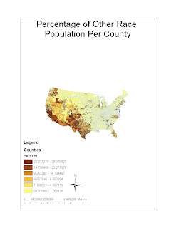


The first map illustrates the percentage of “other race” population per county. Since African and Asian Americans have already been accounted for, I will assume that “other race” includes Hispanics as well as other groups. According to the map, it is obvious that this category of people is very much clustered along the West coast and the southwestern region of the nation. This trend is representative of Hispanic and Mexican-American immigration to the United States. Thus, this map, through the use of GIS, can help us identify institutions, policies, and facilities needed to better help this certain group of people.
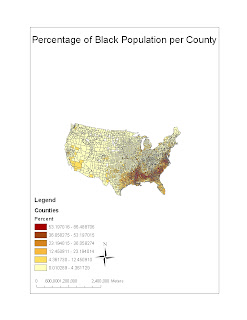
The second map portrays the percentage of African Americans per county. Historically speaking, Blacks have always held a presence in the South. Dating back to colonial times, enslaved people from Africa were brought to this region to cultivate “King Cotton.” To this day, as exhibited by the map, the South is home to this group of people. The use of GIS in making this map can better help us realize the pattern of African American settlement in modern times.
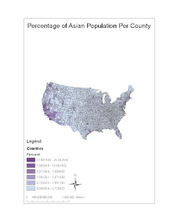
The last map shows the Asian American population as a percentage of a county’s populace. Unlike the first two maps, this one is saturated along both coastal lines. Thus, it can be concluded that the Asian American communities are mostly along either the West or the East coast. This is another useful pattern that is helpful in decision making.
The Census maps overall confirmed many of my preconceived notions of ethnic group patterns in the United States. While the African American population is strong in the South due to historical events, the Hispanic population is predominant in the Southwest due to economic opportunities. Lastly, the Asian American population is coastal in nature and mostly invisible in the interior of America. These maps are useful in that they highlight the settlement tendencies of certain groups. In addition, these maps have the potential of pointing out the flaws and injustices of American history and society. Lastly, these maps can also be made useful to many professionals. Politicians use these as a means of gerrymandering, while law makers use them as a means to figure out the best policies and voting trends.
In conclusion, working with GIS has been a tough, but rewarding experience. Working with such software can be difficult and frustrating at times. However, the end product is fulfilling. Maps created from GIS are not only informative and useful, but also eye catching. They reveal much about the world in which we live. From mapping the station fire using overlay analysis to working with data from the Census Bureau, my experience with GIS has been a positive one. I have learned not only about the software, but also about the patterns and phenomenon of the world in which we live.
No comments:
Post a Comment